TL;DR: What you’ll learn
- What it is: Ecommerce merchandising helps online retailers showcase products to engage customers, drive sales, and boost satisfaction.
- Why it matters: A successful ecommerce merchandising strategy uses customer data, purchase history, and market trends to deliver personalized shopping experiences.
- How it works: Visual merchandising, personalized recommendations, and smart inventory management increase average order value and encourage future purchases.
- Key difference: Unlike traditional merchandising in a brick-and-mortar store, online merchandising uses AI, site search, and high-quality images to guide the customer journey.
- The takeaway: Following ecommerce merchandising best practices helps stores build brand identity, meet customer expectations, and create a seamless online shopping experience.
Your products are great. But customers can’t find them. Bounce rates climb, carts are left behind, and shopping feels more like work than fun.
You’re here because you want to change that.
ecommerce merchandising helps online retailers turn browsers into buyers.
Next, let’s look at what ecommerce merchandising really means and why it matters for your online store.
What is ecommerce merchandising?
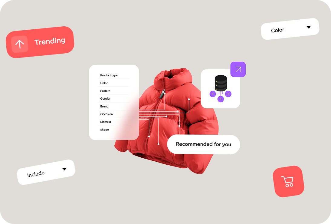
Ecommerce merchandising is how online stores guide shoppers to the right products. It combines product presentation, customer data, and smart tactics to move customers from browsing to buying.
Think of it like this:
- In a physical store, shoppers see the same shelves, displays, and signs.
- In an online store, every visitor takes a different path: from search engines, ads, email, or social media.
That is why online merchandising matters. It creates a smooth shopping experience for every visitor and helps turn more sessions into sales.
Now that you know what ecommerce merchandising is, let’s look at why it is so important for online retailers today.
Why ecommerce merchandising is so important
Strong ecommerce merchandising can make the difference between a quick bounce and a completed sale. For ecommerce stores, it’s one of the fastest ways to boost sales and improve the online shopping experience.
Here’s why it matters for online retailers:
- Online shoppers expect more. They want a smooth customer journey that feels as clear as walking through a brick-and-mortar store.
- Competition is everywhere. Ecommerce businesses and traditional retailers are fighting for the same attention. A strong brand identity and sharp product presentation help you stand out.
- Customer data unlocks growth. Using purchase history, customer preferences, and market trends lets you deliver personalized recommendations across product pages, category pages, and search results.
- Merchandising tactics drive sales. From visual merchandising to site search, the right merchandising strategy increases sales, raises average order value, and encourages future purchases.
That’s why every successful ecommerce merchandising strategy connects customer behavior with smarter merchandising efforts.
Next, let’s look at the main types of ecommerce merchandising and how each one shapes the shopping experience.
Types of ecommerce merchandising
There isn’t just one way to run ecommerce merchandising. Online retailers use different tactics to guide the customer journey and maximize sales.
The best approach combines several methods into a successful ecommerce merchandising strategy.
Visual merchandising
High-quality images, product videos, and clear product placement make product pages and category pages easy to browse. They also help engage customers and boost customer satisfaction.
Personalized recommendations
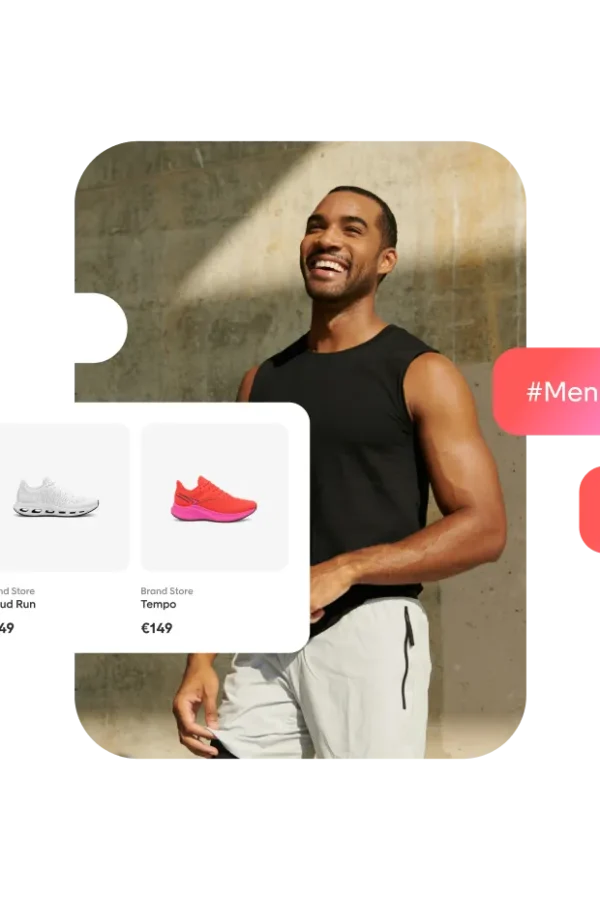
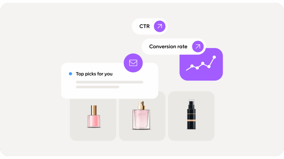
Using customer data like purchase history and browsing behavior lets ecommerce stores suggest complementary products and encourage customers to add more items to their cart. This increases average order value and sets up future purchases.
Search and navigation
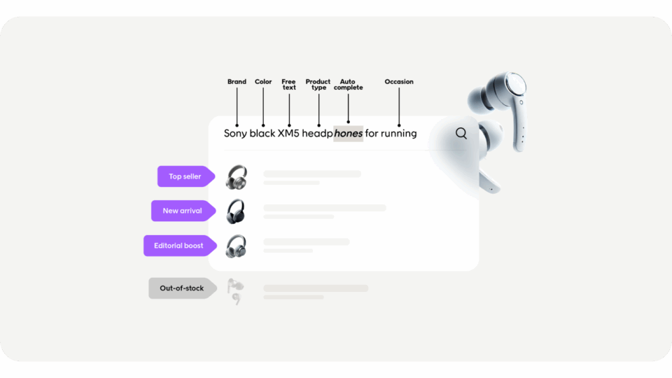
A strong search bar, site search, and optimized search functionality make sure online shoppers can find what they need fast. Better search results also support search engine optimization and improve the online shopping journey.
Product presentation
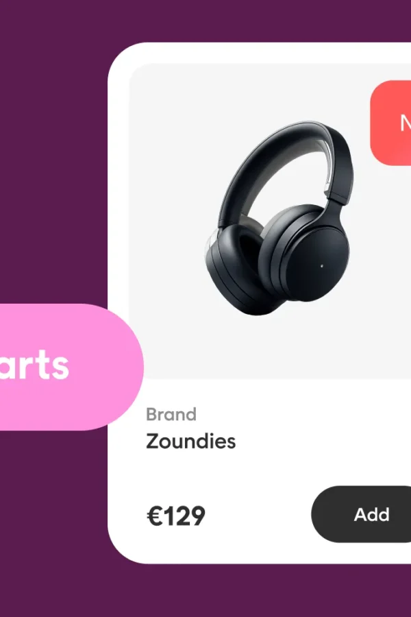
Clear product listings with consistent product information, product placement, and user-generated content build trust and higher customer satisfaction. They also strengthen brand identity across your ecommerce site.
Data-driven tactics
Customer preferences, market trends, and artificial intelligence can guide merchandising teams in planning inventory management and merchandising efforts that drive sales.
Together, these merchandising tactics form the foundation of an effective merchandising strategy that helps ecommerce brands boost sales and deliver a better shopping experience.
Now that you’ve seen the main types of ecommerce merchandising, let’s dive into best practices that every online store can follow.
Ecommerce merchandising best practices: Step-by-step
We get it. Your team needs clear steps that move the needle fast. Use this playbook to build a successful ecommerce merchandising strategy that drives sales and improves the customer experience.
Step 1: Get your data foundation right
- Connect customer data across your ecommerce website, site search, email, and ads.
- Use purchase history and customer preferences to map the customer journey.
- Set KPIs: conversion rate, average order value, search exits, click-through on category pages, and revenue per session.
- Create segments for the average customer, high-intent shoppers, and loyal buyers.
Step 2: Fix the mobile experience
- Speed first. Compress high-quality images and lazy-load product galleries.
- Make filters, sort, and the search bar easy to tap.
- Keep product listings clean. Use clear pricing, badges, and short titles.
- Test the full online shopping journey on real devices.
Step 3: Strengthen search and navigation
- Upgrade search functionality with autosuggest, synonyms, and typo tolerance.
- Show helpful zero-results states with links to category pages and popular queries.
- Use site search analytics to improve product placement and sort rules.
- Align titles and metadata with search engines to support search engine optimization.
Step 4: Upgrade product presentation
- Use consistent product pages with clear specs and size guides.
- Add user-generated content, ratings, and reviews to build trust.
- Keep galleries fast, zoomable, and high quality.
- Highlight value props that match customer expectations.
Step 5: Personalize with recommendations
- Place personalized recommendations on the home page, category pages, product pages, cart, and post-purchase.
- Power rules with purchase history and real-time behavior.
- Cross-sell complementary products to increase average order value and future purchases.
- Exclude out-of-stock items to protect customer satisfaction.
Step 6: Plan inventory-led merchandising
- Tie product placement to inventory management and margin.
- Prioritize in-stock items, bestsellers, and new arrivals.
- Create rules for low-stock urgency without pressure tactics.
- Share sell-through reports with your merchandising team.
Step 7: Run always-on campaigns
- Align merchandising tactics with marketing campaigns and seasonality.
- Use banners and badges on category pages to guide online shoppers.
- Reflect store events from your brick-and-mortar locations on your ecommerce site.
- Keep brand identity consistent across every touchpoint.
Step 8: Test, measure, and iterate
- A/B test sort orders, badges, layouts, and recommendation logic.
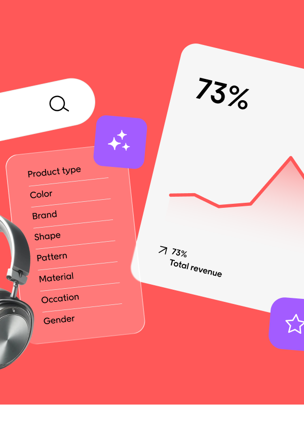
- Track the impact on increase sales, average order value, and engagement.
- Use artificial intelligence to spot market trends and customer behavior shifts.
- Review results weekly, then ship small improvements often.
Step 9: Build a cross-functional workflow
- Define roles for the ecommerce merchandiser, content, marketing, and data.
- Set a shared calendar for launches, product listing updates, and campaigns.
- Hold quick stand-ups to align on priorities and unblock issues.
- Document ecommerce merchandising best practices for new team members.
Step 10: Publish an on-site FAQ to reduce friction
- Create an ecommerce merchandising FAQ that answers sizing, shipping, returns, and fit.
- Link FAQs from product pages and search results to improve customer interaction.
- Use insights from support to update copy and reduce bounce.
- This helps shoppers when they are shopping online and boosts trust.
Follow these steps and you’ll run an effective merchandising strategy that helps online retailers maximize sales, boost the shopping experience, and achieve higher customer satisfaction.
All that’s left is for you to get started.
The path forward for your ecommerce merchandising journey
Ecommerce merchandising works best when your team focuses on clear, simple actions.
Here are the next three steps to take:
- Review your site experience. Check product pages, category pages, and search functionality. Make sure online shoppers can find and buy products without friction.
- Use your customer data. Apply purchase history, customer preferences, and market trends to personalize recommendations and product placement.
- Test and measure. Track how changes affect average order value, sales, and customer satisfaction. Use these insights to improve your merchandising strategy over time.
Start here and you’ll build a stronger online shopping journey, improve customer interaction, and create higher customer satisfaction.
Book a demo to see how Voyado can support your merchandising team in driving sales and delivering better shopping experiences.
FAQ
What is ecommerce merchandising?
It’s how online retailers showcase products on an ecommerce site. A successful ecommerce merchandising strategy guides the customer journey, uses customer data like purchase history, and applies visual merchandising and product placement to increase sales.
How is online merchandising different from traditional merchandising?
In a physical store, customers see the same displays. Online merchandising is dynamic. It uses personalized recommendations, search functionality, and high-quality images to engage customers. This approach helps ecommerce businesses maximize sales and meet customer expectations in ways traditional retailers can’t.
What are the benefits of ecommerce merchandising?
- Boost sales and average order value
- Improve the online shopping journey
- Deliver higher customer satisfaction
- Strengthen brand identity and loyalty
- Help merchandising teams make data-driven decisions
What tactics should my merchandising team focus on first?
Start with three essentials:
- Optimize the search bar and site search to improve search results.
- Improve product pages and category pages with consistent product listings, clear product presentation, and user-generated content.
- Use customer preferences and complementary products to encourage customers and drive future purchases.
How do I measure success in ecommerce merchandising?
Track KPIs like conversion rates, average order value, bounce rate, dwell time, and product listing performance. These metrics show how well your merchandising efforts engage customers and increase sales.
Can artificial intelligence improve my merchandising strategy?
Yes. AI helps analyze customer behavior, market trends, and inventory management. It supports effective merchandising strategies by showing personalized recommendations, improving product placement, and helping your merchandising team adapt quickly to changing shopper needs.

